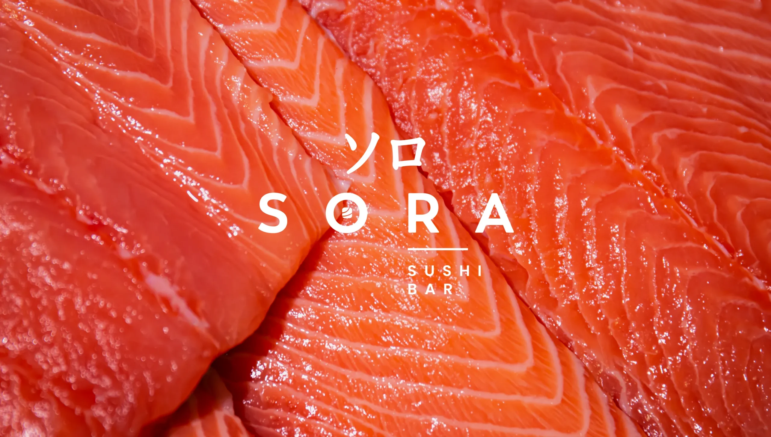
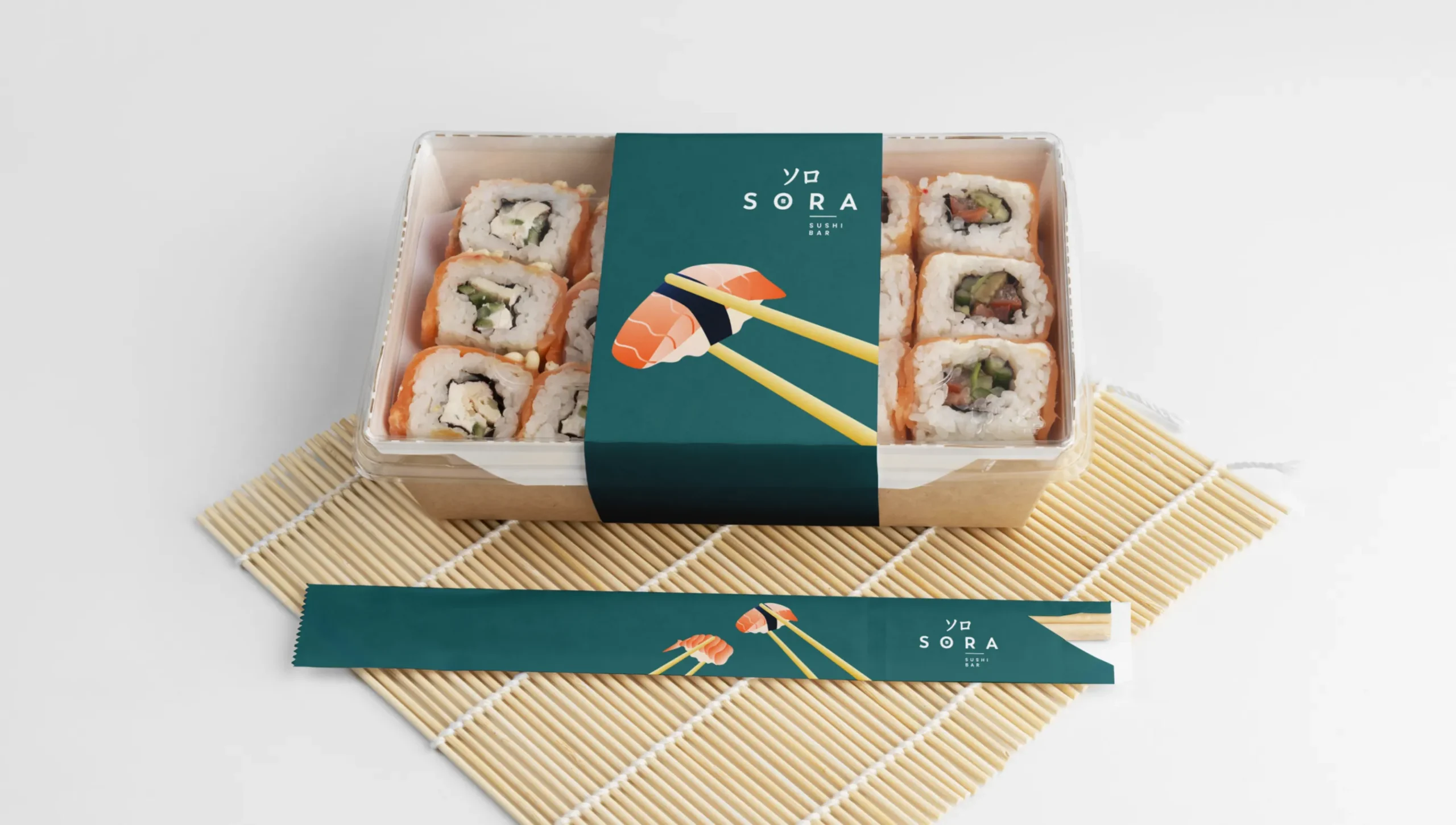
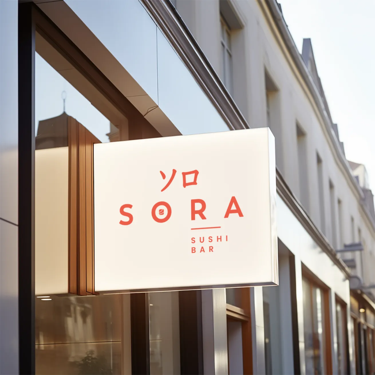
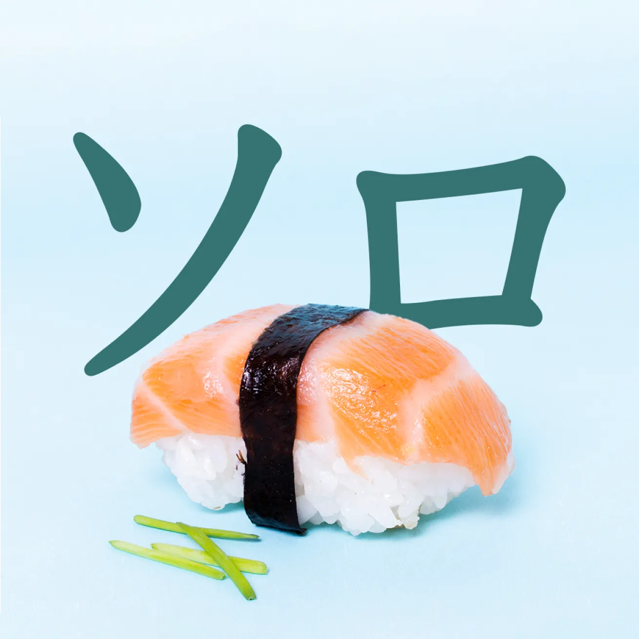
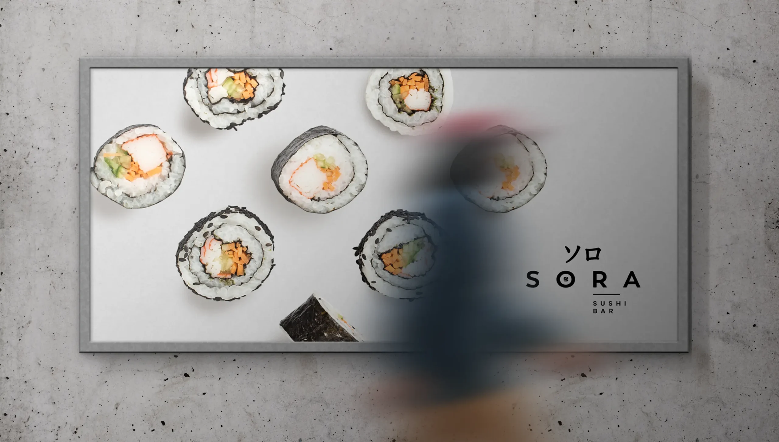
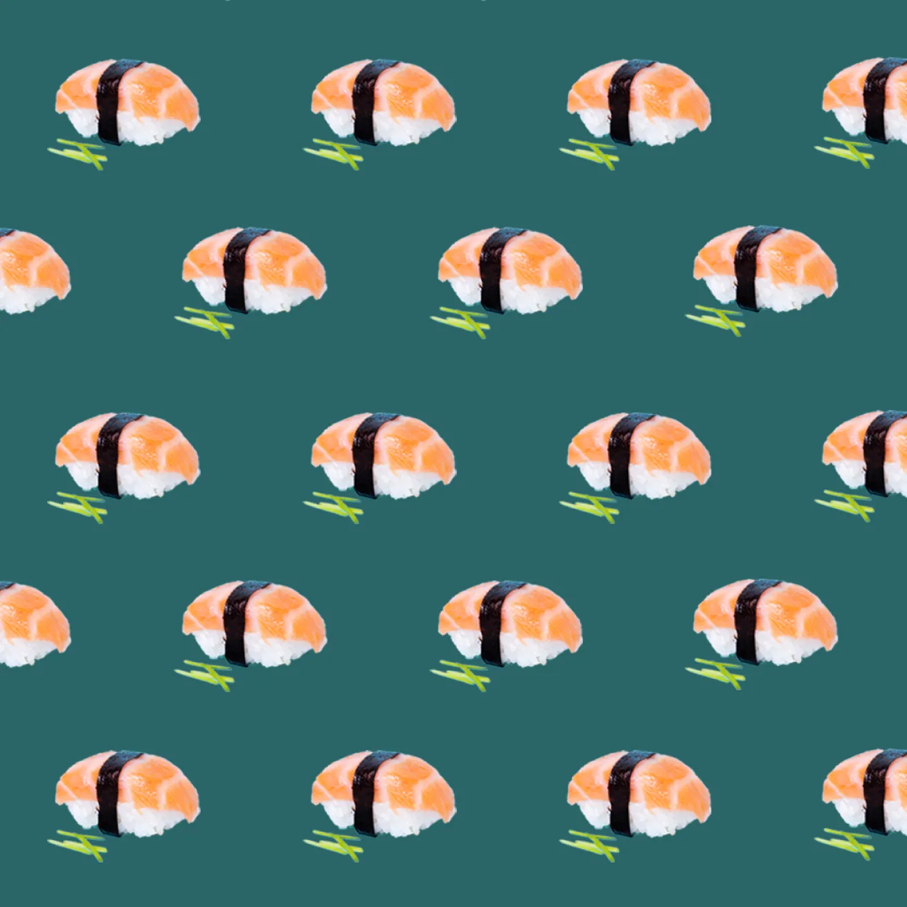
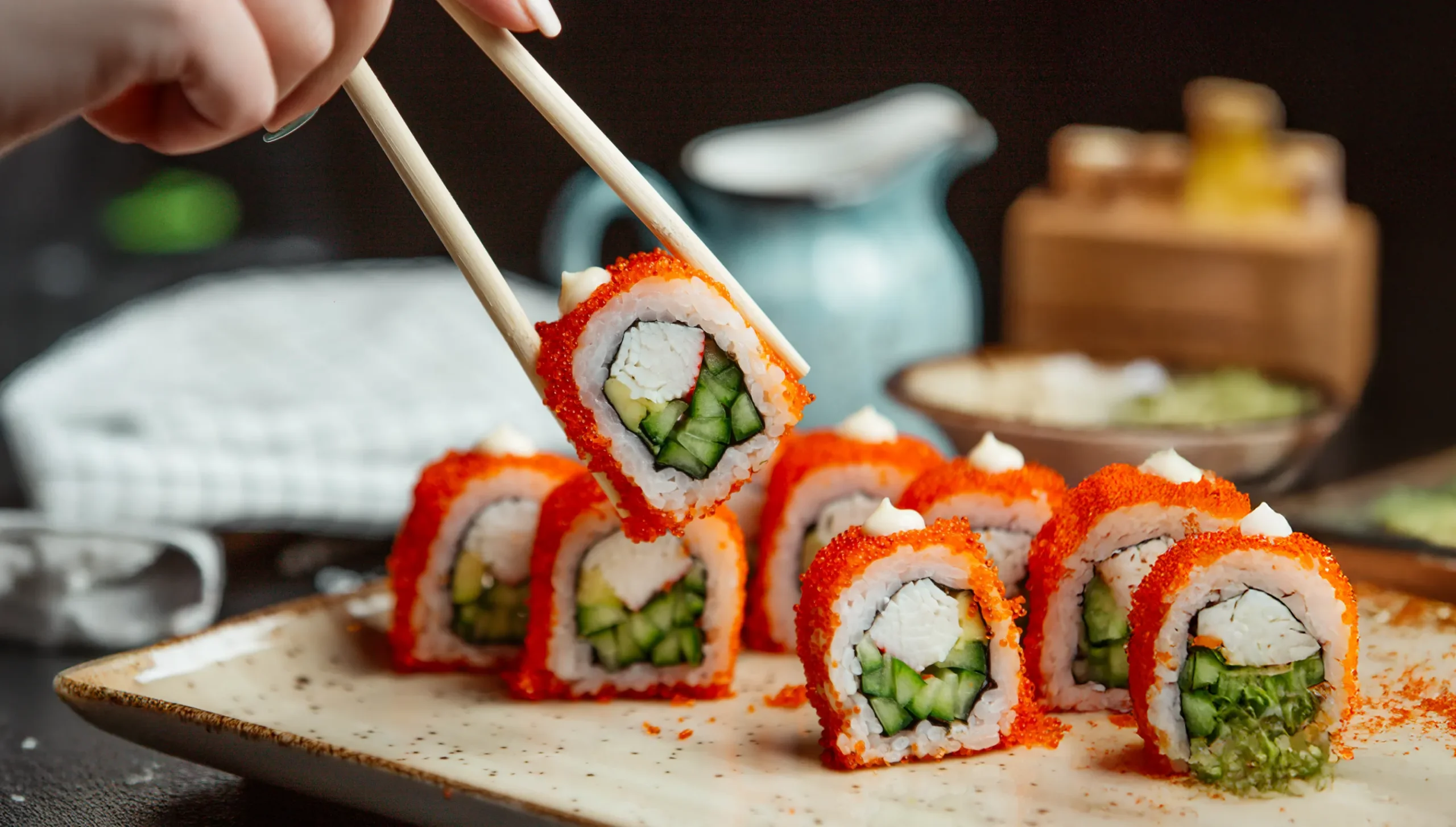
Sora, a sushi bar inspired by the vast skies and serene Japanese landscapes, sought a brand identity that embodied elegance and tranquillity. We crafted a visual identity that merges minimalism with tradition, designing a refined logo, sophisticated packaging, and an immersive brand experience. Every design choice from typography to colour palette was made to evoke elegance, balance, and the art of sushi-making. Beyond aesthetics, this identity fostered recognition, trust, and an emotional connection, ensuring Sora’s presence lingers in the minds of its customers long after their last bite.
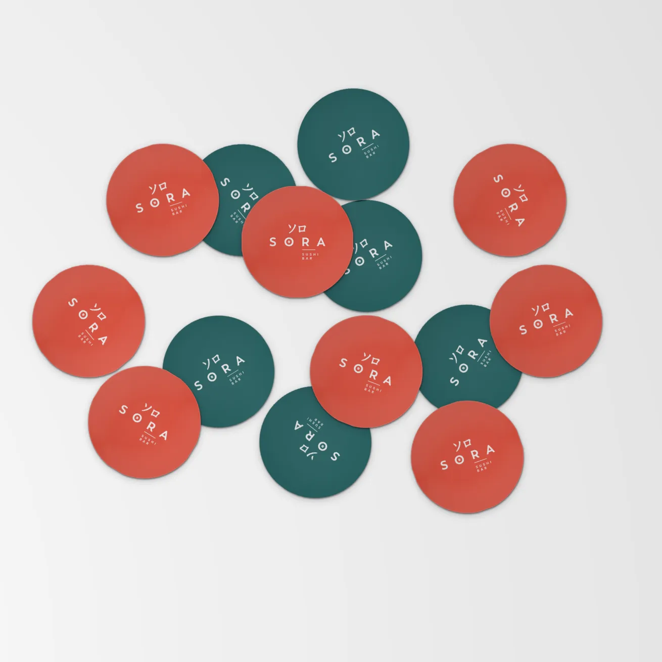
R:238 G:93 B:75
#EE5D4B
R:54 G:114 B:115
#367273
R:0 G:0 B:0
#000000
R:255 G:255 B:255
#FFFFFF